I was torn about including the Challenge Cup matches in this analysis. Because it’s supposed to be covering the League, and the Cup is separate from the League.
On the other hand, as L pointed out when I asked, Rugby League is not like football; because the Super League teams only join the cup in the 6th round, there isn’t as much squad rotation. Therefore, I am going to include the Challenge Cup games.
Of course, the minute I do that, Saints don’t play two of their previous “always presents”, Makinson and Dodd, in the Challenge Cup match against Leeds. Dodd was explained as a precautionary, but I’m not sure if an explanation was ever given for Makinson’s absence. Saints also played Clark and Mbye together, which is also going to confuse the diagrams.
The changes to the team meant the “play together when Saints score in game 6” matrix looks like this:
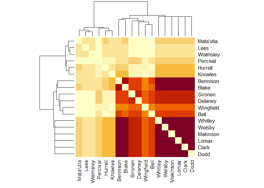
The most interesting thing to me is that the crossing point for Batchelor, Wingfield, Delaney, Bell and Clark and Knowles and Walmsley is so pale, suggesting that those two don’t play on the pitch with the others when Saints score.
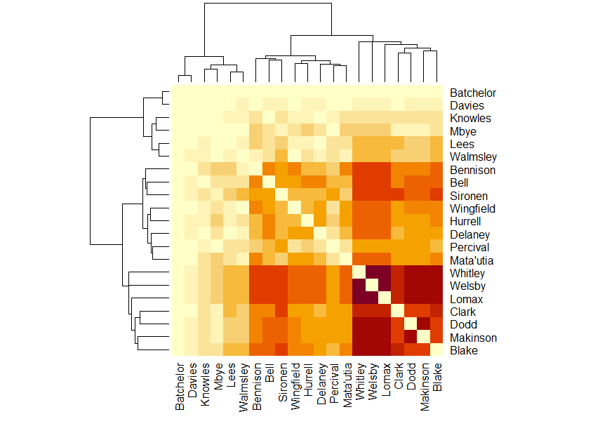
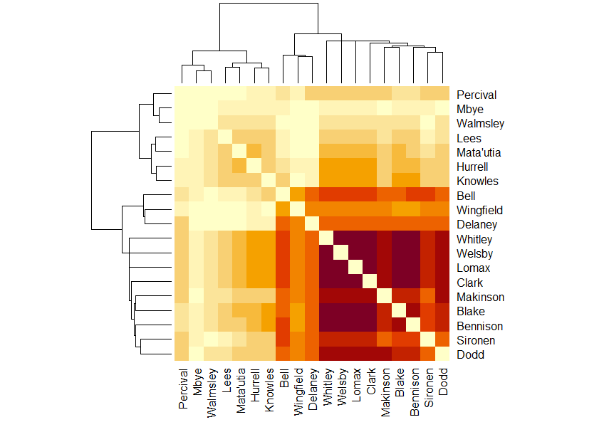
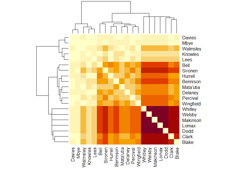
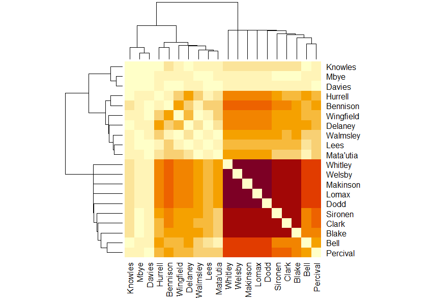
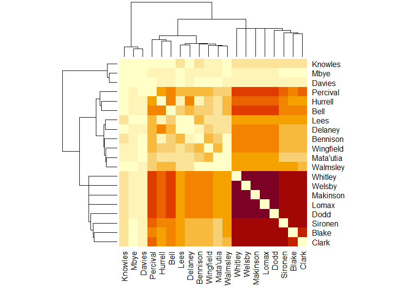
In the point-scoring moments present for diagram, for the season to date, the Whitley, Welsby, Lomax, Dodd and Makinson group has been broken up.
The dendrogram has become very complicated.
Which also makes the matrix complicated.
As well as Sironen and Clark’s crossing point being darker than their surrounding area, suggesting they play together more often, so is Clark and Lees and Walmsley and Sironen, while Walmsley and Clark, Clark and Delaney and Percival and Blake have paler crossings than expected.
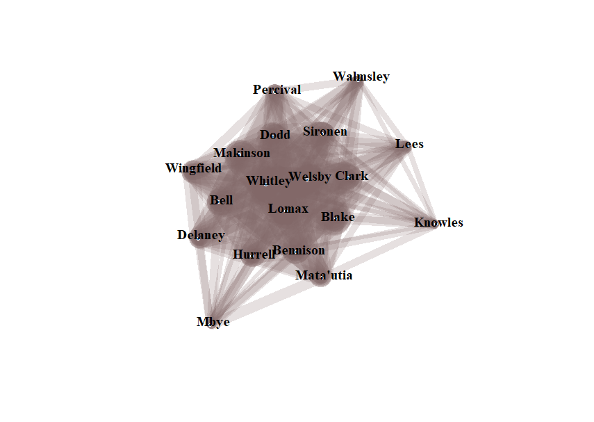
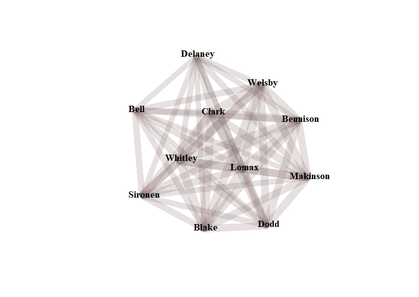
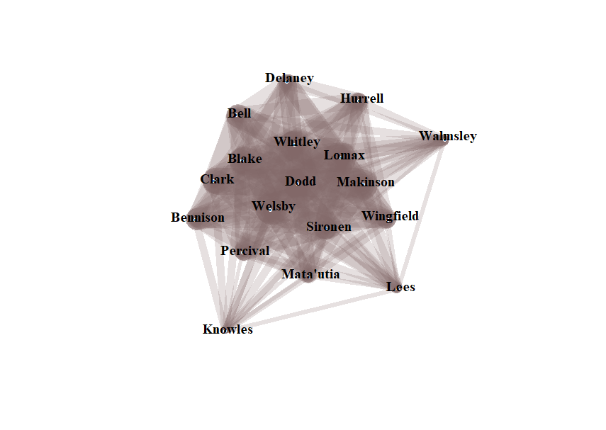
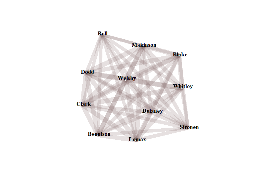
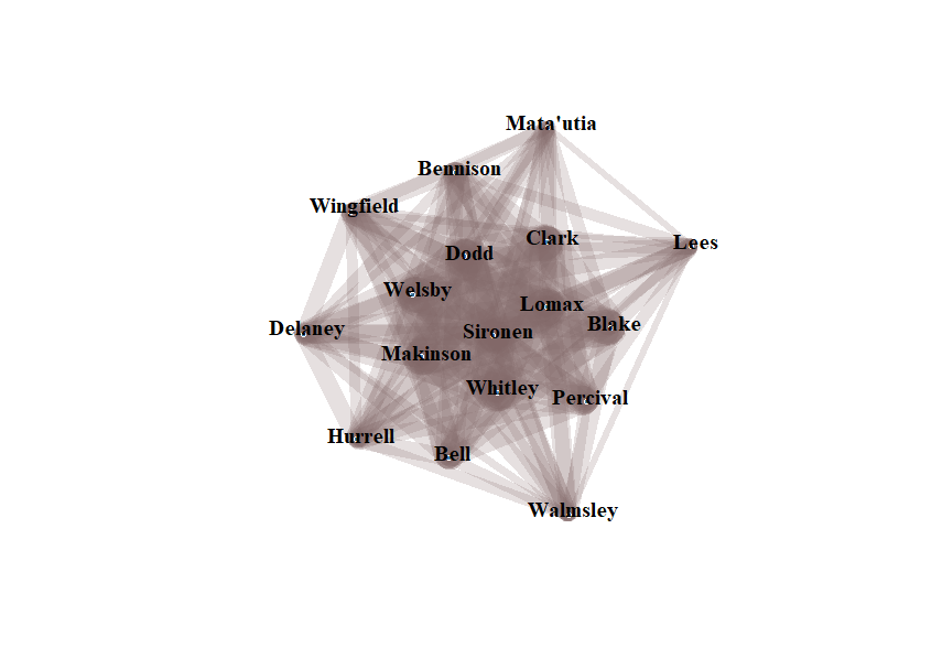
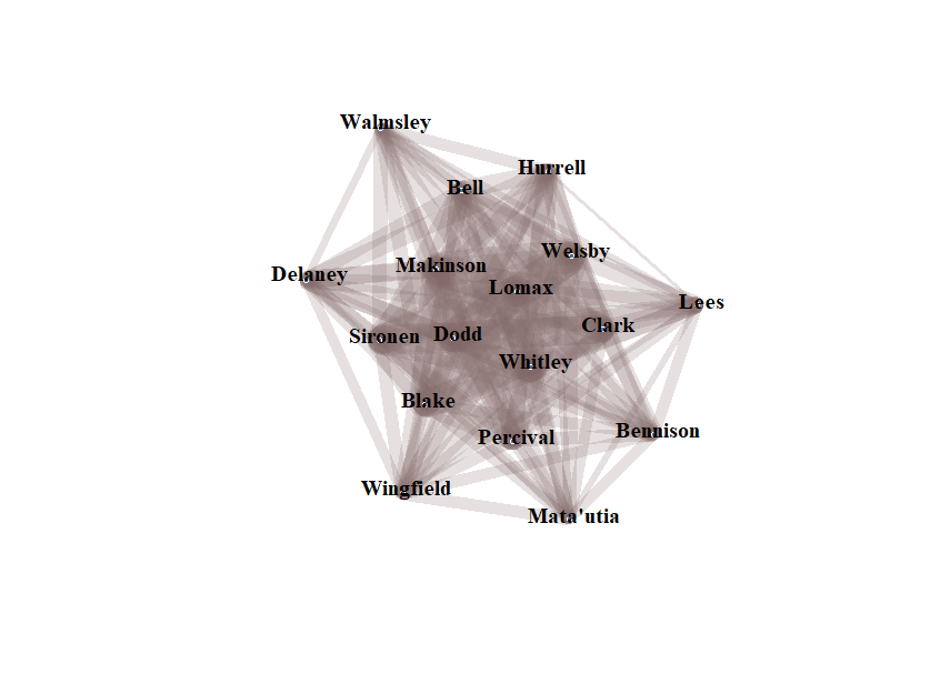
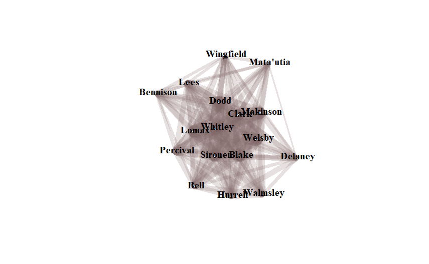
The network diagram looks like this:
It’s now 19 players. It’s interesting that his suspension for two games has moved Percival out of the middle, and there’s now a decided cluster of replacement props at the left.
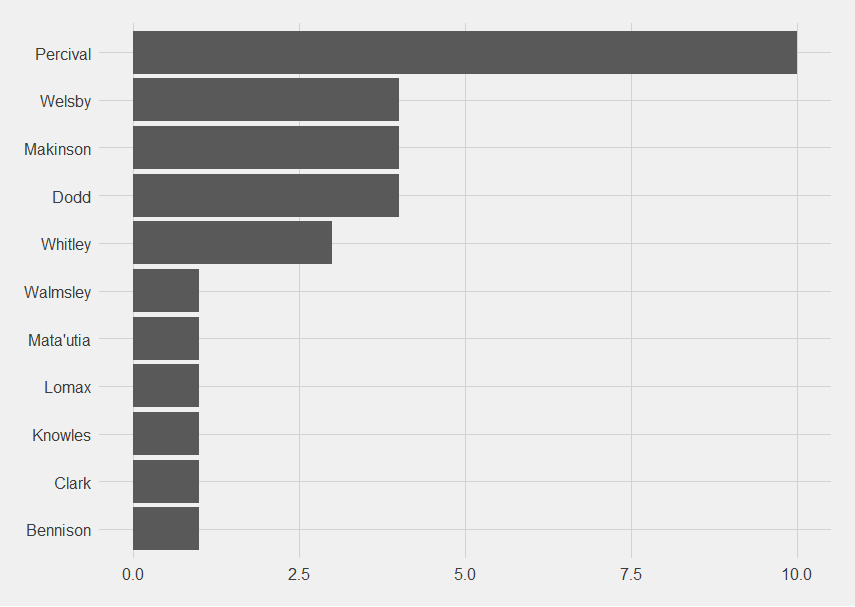
Looking at the concession diagrams,
Clark is higher up in this than expected.
Whitley, Welsby and Lomax are ever presents so their presence makes sense. Clark’s less so.
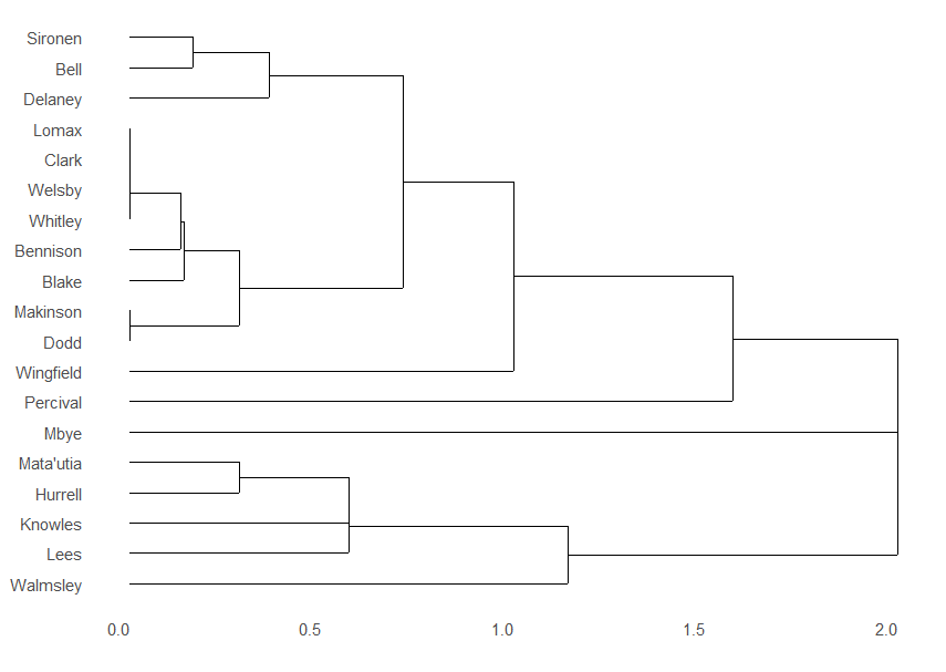
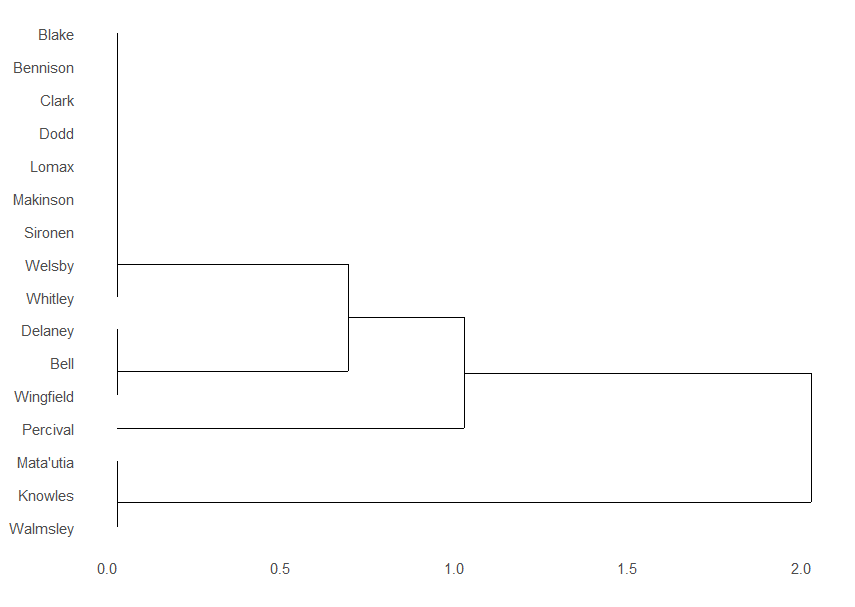
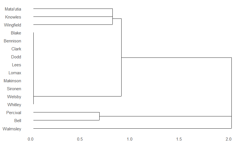
The dendrogram is three clusters, and three straight lines:
I do find it interesting that there’s two separate forward clusters, possibly suggesting forward pairings.
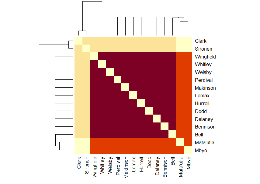
The matrix looks like a zoomed-in tartan.
The Blake and Mata’utia, Mata’utia and Hurrell, Sironen and Bell and Bennison and Bell crossing squares are darker than expected, while the Bennison and Mata’utia, Makinson and Sironen, Mbye and Makinson and Walmsley and Sironen crossings are lighter than expected.
The concession network graph still only has 11 players on it.
I’m not sure why Welsby is in the outer ring, not the middle.
I don’t think it’s quite at the point where I can guess the starting 17, but I think it’s getting there. I blame uncertainty around the forwards.
Saints proceeded to not help matters by not turning up for the first quarter of the match.
When Saints conceded:
This match was also the first time the Saints live text has let me down. I know Mbye must have come on before he scored, but it didn’t say when, so there’s now going to be a slight * against him and Clark’s data (because if he came on for anyone, it was Clark as they are our hookers). The advantage to getting data over a whole season is that one oops ought to be watered down.
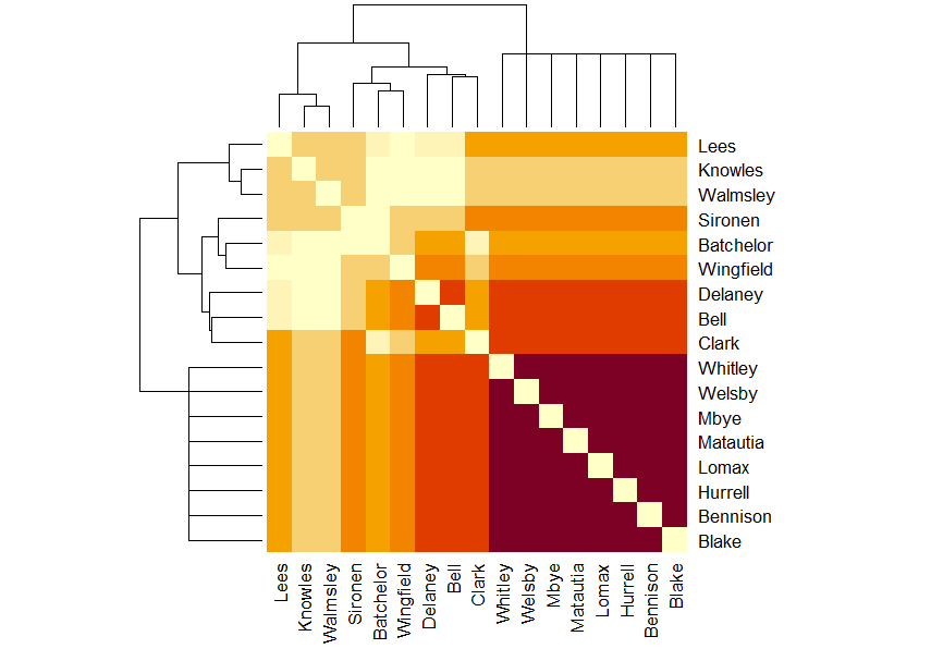
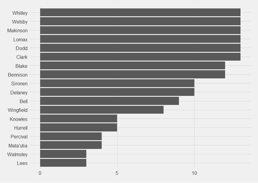
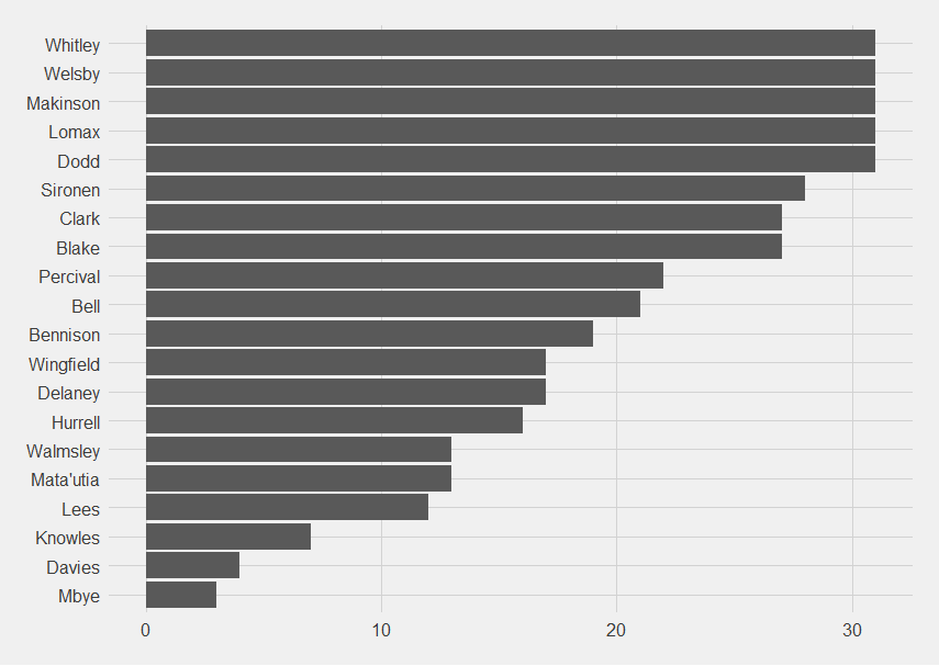
Okay, let’s look at point-scoring moments players were present for:
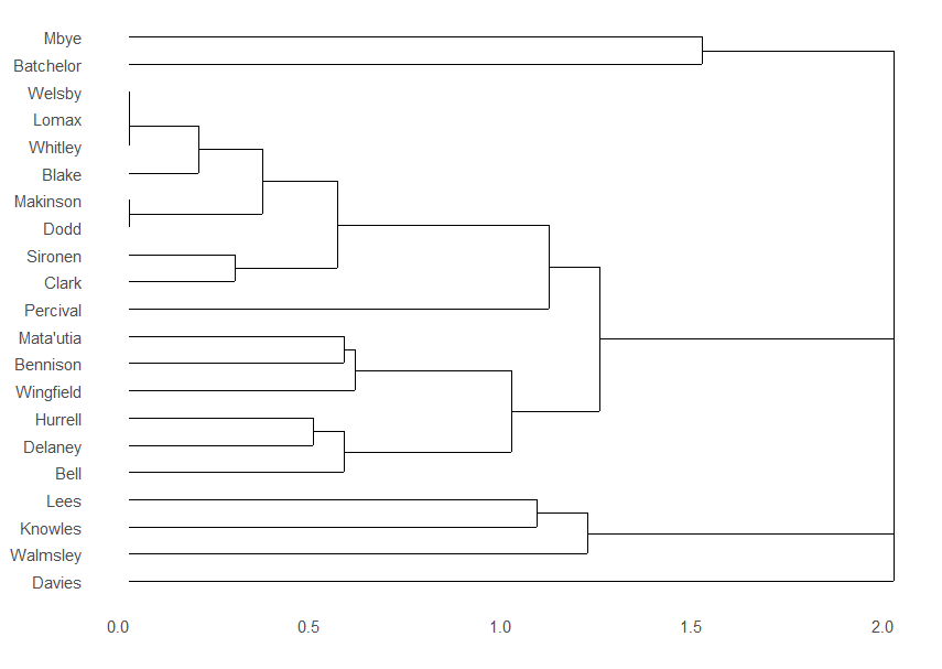
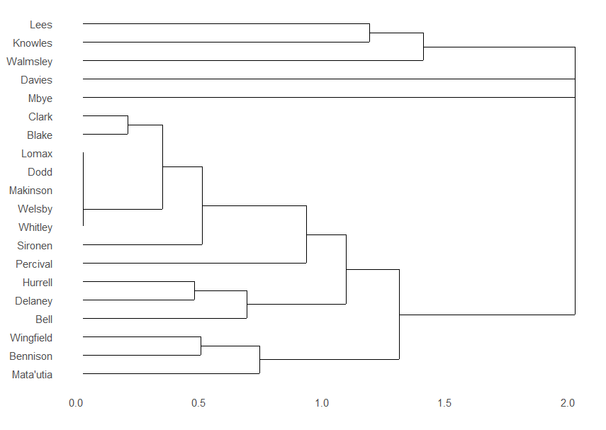
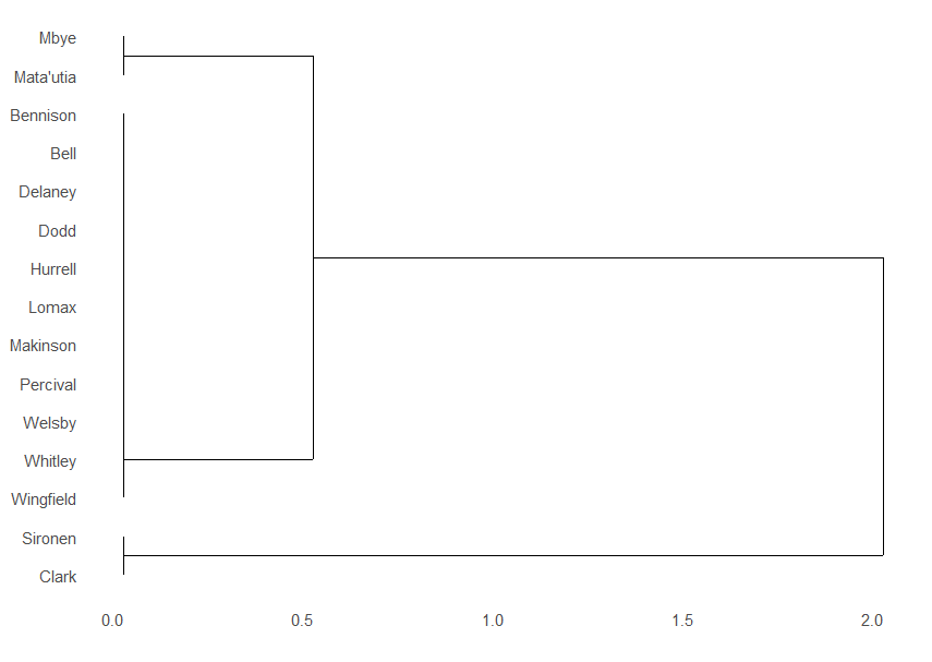
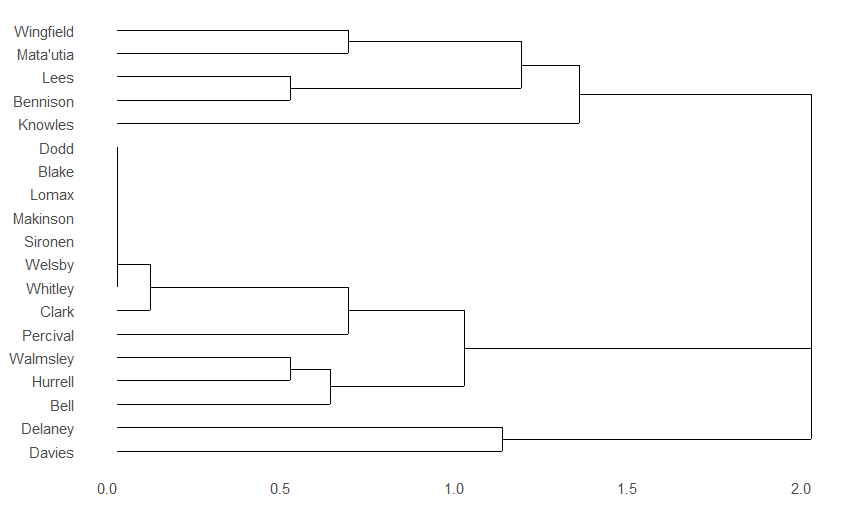
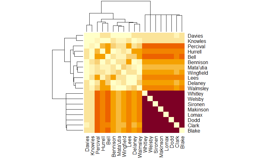
The dendrogram for when players are on the pitch together at Saints’s point-scoring moments has become more complex, there’s only really one true cluster left, of Lomax, Makinson, Dodd, Welsby and Whitley.
What is interesting is that there’s now two clear “families” of players, Lees, Knowles, Walmsley, Davies and Mbye in one, and everyone else in the other.
I know Lees and Knowles haven’t played as much as I would have expected, Davies barely at all, and Mbye only when they need to spell Clark, but I felt Walmsley had played more. So count one for stats telling you something you don’t feel.
On the other hand, the matrix diagram does have Walmsley in a darker colour than the others so maybe he is just very effective when he is on the pitch.
The network graph is now an interesting shape, with a central cluster with Walmsley, Lees and Knowles hanging off.
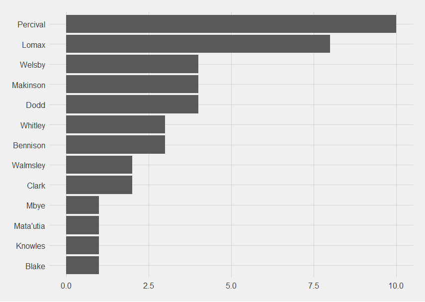
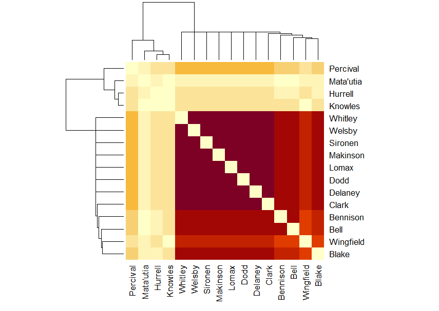
Looking at when Saints concede instead:
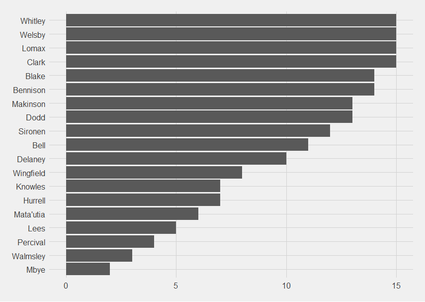
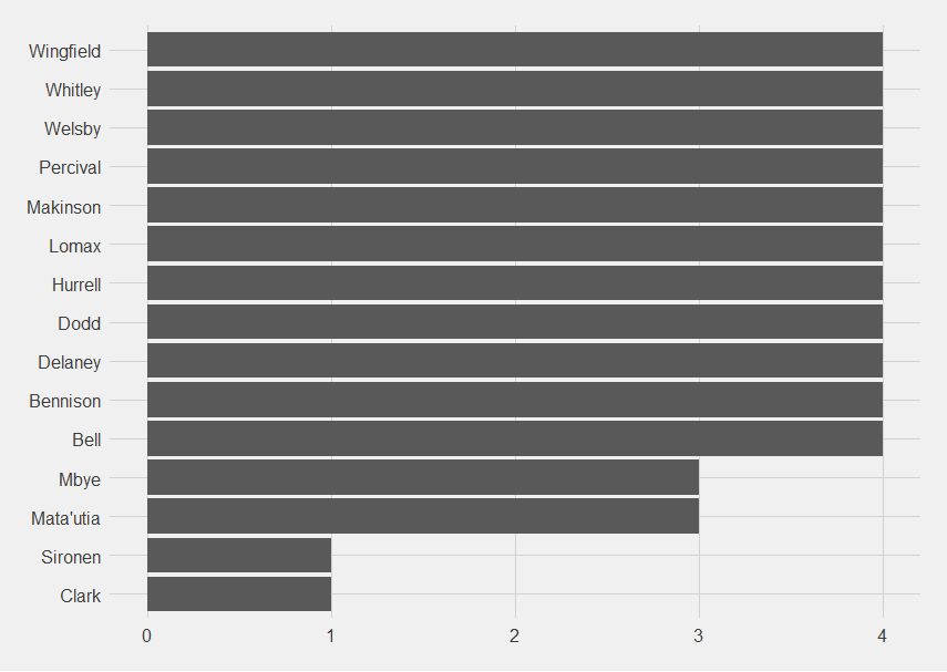
The players present for the most (Whitley, Welsby, Makinson, Lomax, Dodd and Clark) are the ones that have been present the most when Saints score, with the exception of Clark who is sometimes swapped out for Mbye.
Looking at the players present for the least, Walmsley and Lees are present for the least, with 3, then Percival and Matautia with 4 and Knowles and Hurrell for 5, I’m starting to wonder if I have anyway of looking at it divided by time played, because I know Percival was being subbed out at 50 mins even before the sending off.
The concession dendrogram has the same pattern as the bar chart.
The concession matrix has an interesting pattern of colours
I was only expecting one really dark cluster, not two, and the points where Sironen, Delaney, Wingfield and Bell cross Matautia, Lees and Walmsley are so pale that it is clear that they do not play together, so I think we can really start to see who the forward pairings are when Saints concede. Wingfield and Knowles don’t play together, and neither do Bell and Hurrell.
That Percival doesn’t play with Matautia, Lees and Walmsley is unexpected.
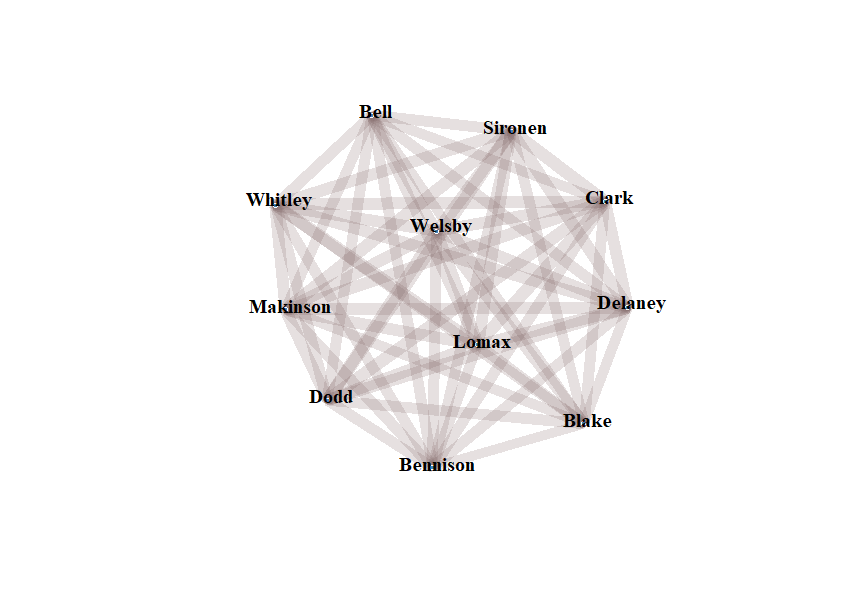
There are still only 11 players on the “when Saints concede” network diagram,
L was slightly concerned that I hadn’t stated that I was a Saints fan quite loudly enough in my previous posts. I think it may become obvious throughout this summary of the Saints vs Salford match.
That does explain why Percival is, once again, alone in the dendrogram.
It shows you that Sironen put one heck of a shift in to cover for Saints being a man down.
This match has an interesting effect on the “up to the end of game 4” charts.
When Saints score still hasn’t really built up into an informative pile of data, but point-scorers (no division between tries and kicks) is starting to.
Percival having the most moments makes sense, with him being the kicker (if only he could convert more often), and Dodd and Makinson who can also kick makes sense, Welsby up there highlights his wonderful poaching abilities. Whitley on 3 is an unexpected bonus. He’s working out well so far, isn’t he?
Point-scoring moments present for also highlights those players, and makes it clear Clark is definitely first choice hooker.
I do like how high up some of the academy grads are. I mean the most recent crop, not some of the older heads (help, Lomax is now an older head).
The matrix is starting to look complicated:
The network diagram does give a nice matchday 17 – Sironen, Dodd, Clark, Lomax, Blake, Percival, Whitley, Makinson, Welsby, Matautia, Lees, Walmsley, Bell, Hurrell, Delaney, Wingfield and Bennison.
Because Salford scored several points, there’s now enough data to have some solid numbers for “players present when Saints concede”. The only problem is it won’t include Percival as much as it maybe should given his sending off was sort of responsible for some of the concessions.
Percival is also a darker colour than expected on the concession matrix.
The network diagram for players present when Saints concede only has 11 players on.
The diagrams are mostly making me appreciate Sironen at lot more.
On the other hand, more evidence that Ferrari are cursed. Last race, one car had weird brakes, this race, one driver had an emergency appendectomy. Honestly worried about what Australia will bring.
The most important thing is that Sainz jnr is healthy and well (and remarkably up and about).
The understudy wasn’t bad 🙂
Not sure I quite understand the people saying they’re Ferrari fans and wondering why Ferrari are going with Hamilton not Bearman. Mostly it makes me feel like this
When have Ferrari ever put a rookie in the car (permanently)?
It’s not the Ferrari way. They loan them out for a couple of years to any team that they give engines to and then see how they do. You don’t want a rookie learning not to do that in a Ferrari that’s supposed to be fighting for the Constructors’ Title (accent on that supposed to be with a vengeance).
And oddly, you’ll notice Hamilton’s contract finishes just in time for Bearman to have been seasoned at probably Haas.
In terms of racing, the Saudi Grand Prix was a dud, with most of the excitement coming in the KMag Zone, an area of a Viking rage, determination, chaos and 20 seconds worth of penalties.
Matters were helped by not having Saints players subbed off injured like last time and John Asiata getting sin binned.
Looking at game 3 in isolation:
Which players were present when Saints scored?
It’s nice to see Mbye getting some game time.
The game 3 dendrogram shows the same pattern as the grouping for how many point-scoring moments they were present for:
The matrix shows the same, but with top and bottom swapped
Mbye and Matautia and Sironen and Clark not sharing time makes sense, given its a forward and a hooker and another forward and a hooker.
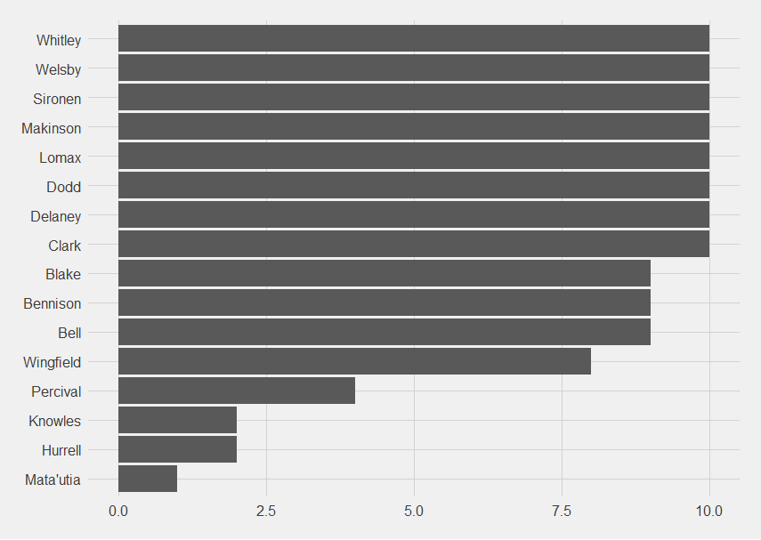
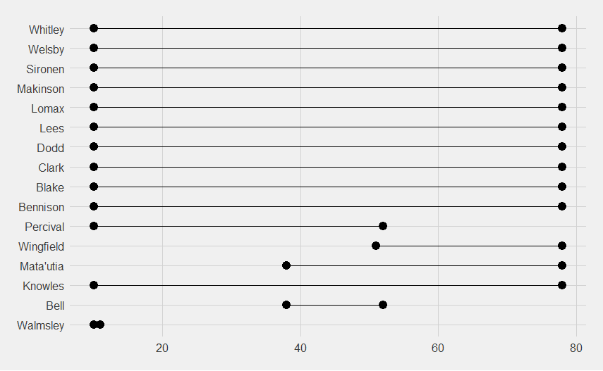
Now, the season to date:
The point-scoring moments players were present for:
Operation “Wrap Percival in Cotton Wool” is very apparent. Sironen is doing more minutes than I realised.
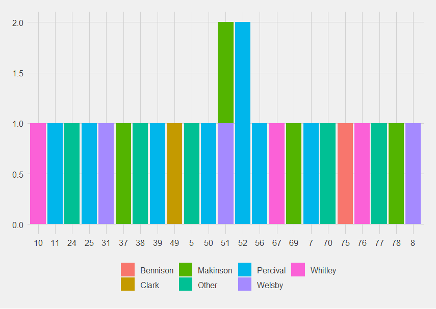
Now looking at the actual scorers and when they scored:
I just think it’s pretty.
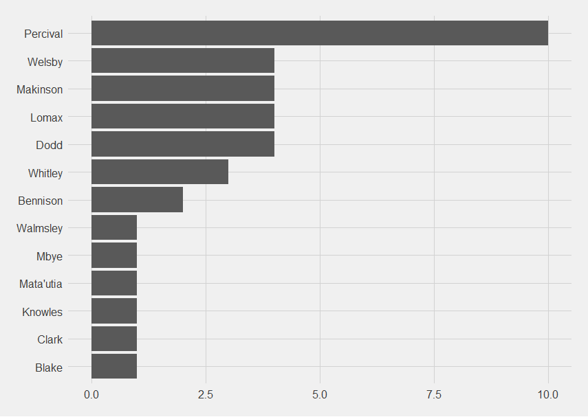
Percival, despite everything, had the most point-scoring moments with 8, then Makinson with 4, Whitley and Welsby on 3, then Walmsley, Matautia, Lomax, Knowles, Dodd, Clark and Bennison on 1.
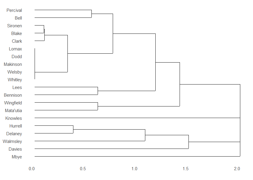
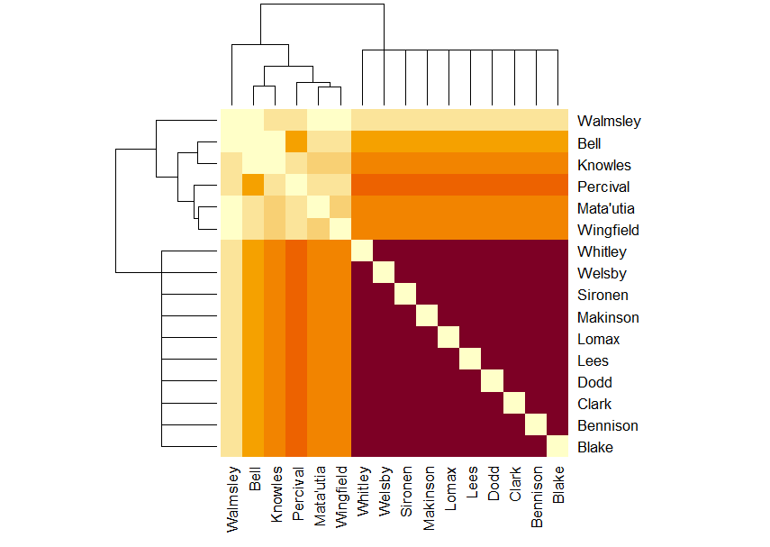
The dendrogram is now a lot more complicated.
That complication is reflected in the matrix, where there’s now a block of solid purple, the red, then the mixed part which is the players who sub on and off frequently, then the very top, palest rows, which are the players who haven’t played often (yet).
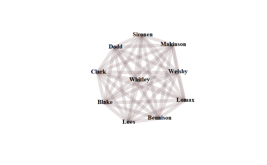
The network graph for the season is 17, which is a nice number for a squad.
The Saints defence conceded against Leigh. Having only conceded two point-scoring moments in three games (versus creating 25 point-scoring moments), it feels petty to name players present.
One interesting pattern, on an N of 2 mind you, is that both points were conceded in minutes 40-50 (44 and 46 to be precise). That’s just after half time so I’m wondering if it’s Saints not being fully switched on when they first come back.
Or I’m being hyper-critical and impossible. Which is very possible.
Going back to the bingo cards seems a little churlish since Ferrari, solidly the second best team.
On the other hand, one car had brakes that both stopped and shunted the car to the right, and Ferrari are 25 seconds behind the fastest Red Bull (and 3 second behind the second Red Bull).
There was also the opportunity to reshuffle the bingo card and add a couple of fresh squares.
Taking a positive from Bahrain, at least the Red Bulls aren’t 50 points ahead … yet.
And despite their on-going attempts to cause me to shriek in public (because I watched the race in a Walkabout), at least the Ferraris didn’t hit each other.
I fear this season is going to be a lot of finding of tiny victories while Red Bull take all the big ones.
Included will be the game 2 visualisations, and the visualisations covering games 1 and 2. What there won’t be is the defensive visualisations, because Saints kept Huddersfield to nil in the game (https://www.bbc.co.uk/sport/rugby-league/match/EVP4369771), so there’s still only one data point there.
As a Saints fan, this pleases me immensely. I’m fully behind “Saints, the entertainers” but a lot of that flair comes naturally (The Saints Way etc), so defensive solidity is a nice addition. The best Saints teams have combined both.
The game 2 dendrogram again shows that central core of players who play most of the game, the prop swaps, and that Saints are continuing the policy of wrapping Percival up in cotton wool once the game is won. I still approve.
Line chart showing when players were on the pitch when Saints scored
Game 2 Matrix diagram
The darkest cluster are Whitley, Welsby, Sironen, Makinson, Lomax, Lees, Dodd, Clark, Bennison and Blake who played the whole game. Percival is the darkest orange but separated from them because he left the pitch early.
Knowles, Matautia and Wingfield are the next shade down, reflecting the rolling substitutions, then Bell, then Walmsley the palest, reflecting his single stint.
I hadn’t realised how central Whitley was, but I can believe it.
If we look at the combined data sets they look like this.
Season to date data visualisations
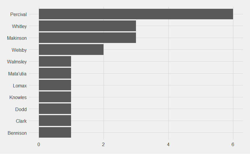
Who scored points for Saints? – with the note that it’s point-scoring moments, not number of points.
Despite being taken off early, and all the missed conversions which will undoubtedly haunt us come the big matches, Percival has had the most point-scoring moments.
Dendrogram year to date:
There are some clear prop clusters, Wingfield and Mata’utia, Walmsley, Hurrell and Bell. The Davies and Delaney cluster is pleasing to see because it suggests they’re slowly blooding them in.
It looks like the spine of the team are Dodd, Blake, Lomax, Makinson, Sironen, Welsby, Whitley and Clark. Percival is there for all the point-scoring moments until he gets subbed off at 50 minutes.
This pattern is also seen in the matrix diagram:
The matrix reflects the dendrogram, but you can also see some interesting patterns, like Bell and Knowles not playing together, Hurrell playing less with Lees, Bennison and Knowles and so on. These patterns will both strengthen during the season and might get more mixed up as injuries (and suspensions) take their toll.
The network diagram looks like this:
It’s interesting that two games in there’s already a clear central core and then a secondary ring.
Will have the data from the Leigh game inputted when I get an hour to spare.
In the drivers’ championship, the number of results affected is 13/349 (3.72% of all results), and none of those are in the top 3 of any given year.
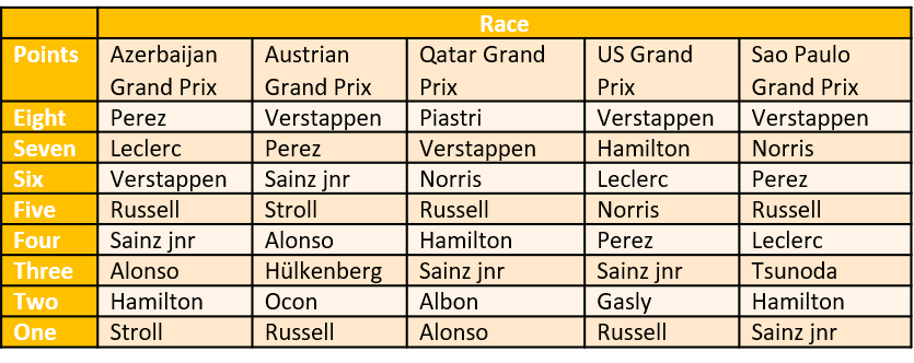
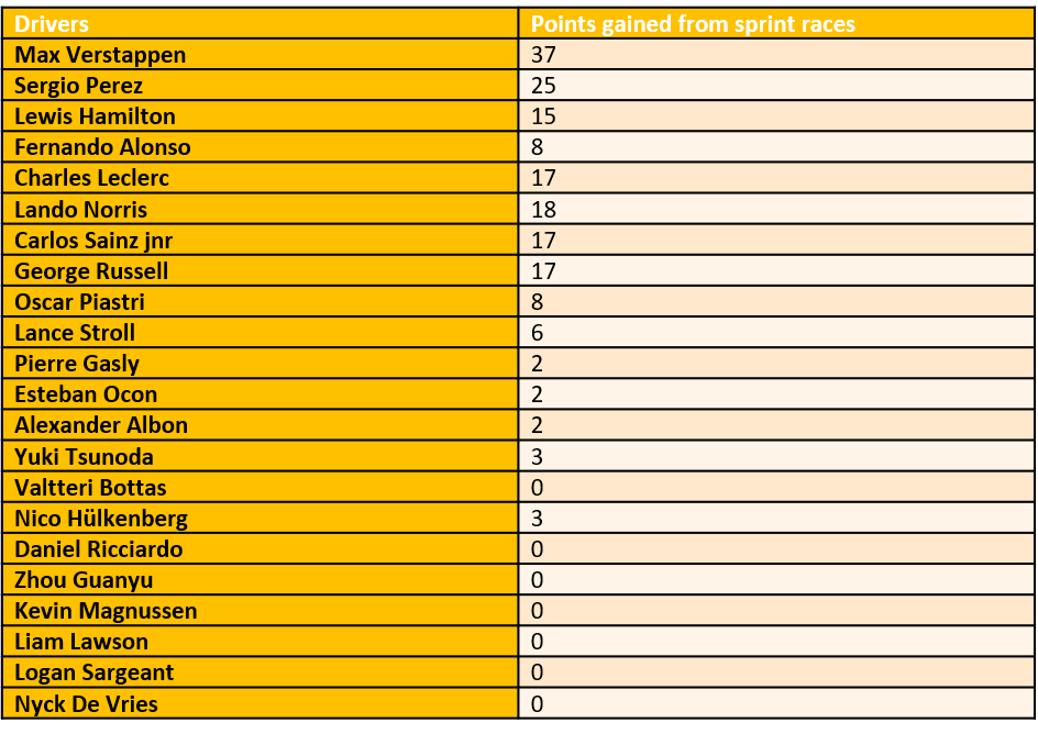
Let’s look at the sprint races, which I expect to have a greater effect due to the quite frankly ridiculous number of them and the points available for them.
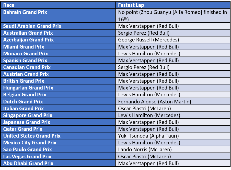
The sprint race points were as follows:
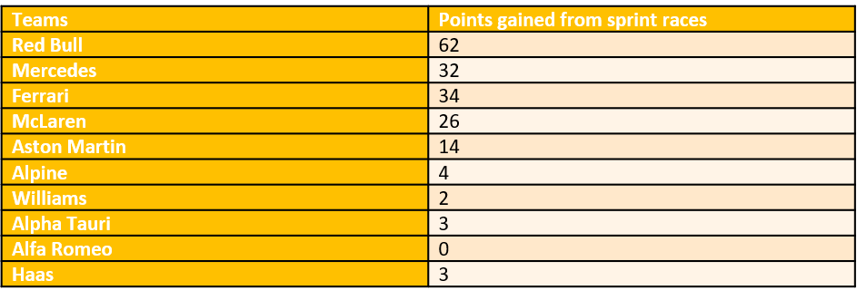
Team points from the sprint races:
Drivers’ point from the sprint races:
Do the sprint race points have an effect on either championship?
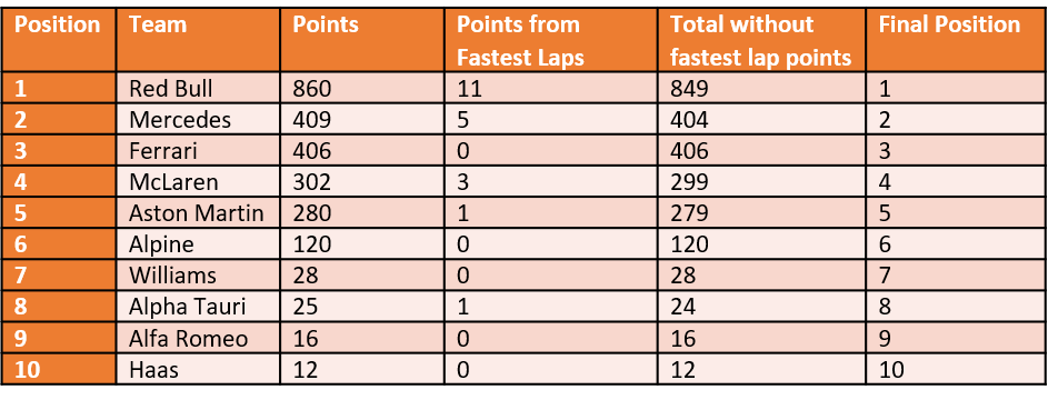
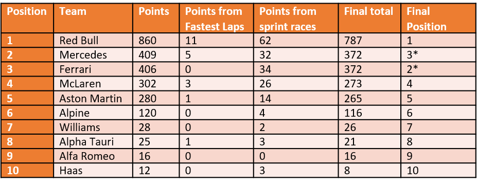
Constructors’ championship with and without the sprint and fastest lap points
*Ferrari move up if they have the same number of points due to the Singapore Grand Prix victory
So it does have an effect on one of the important positions.
After 2 years, sprint points have had an effect on 6/20 constructors positions.
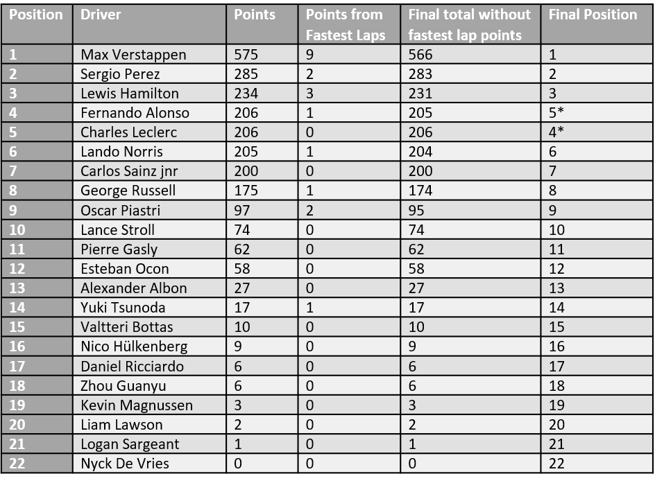
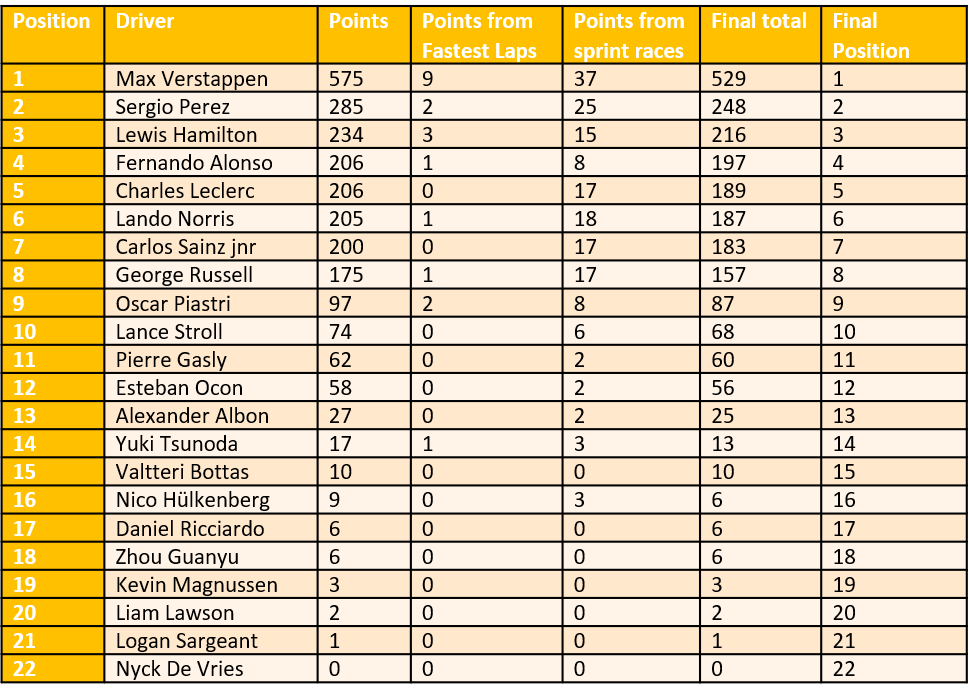
Drivers’ championship with and without the sprint and fastest lap points
Hülkenberg stays ahead of Ricciardo on count back. Zhou stays behind them, also based on countback to best finish.
Giving points to almost half the field 5 times a year changes the position of 0 of the drivers. That suggests that there are gaps in performance between the drivers and that the sprint races don’t do anything to disturb that (just say no to sprint races in the present format). Over 2 years with sprint races, 6/44 results have been changed.
What have we learned? • The 1 point for fastest lap is too small to affect anything. I think that’s also why the top teams have stopped going for them, which I think is reflected in more drivers and teams getting fastest laps in 2023. • The sprint races really don’t do anything to disturb the existing order, and only strengthen the points totals of the good teams, creating further separation between them and the weaker team. • Red Bull, stupid amounts in front of the other teams. • Everyone else pretty much coming in two by two except Alpine. • In the driver’s championships points totals it’s either large gaps or serious scrunching up of points. • It would be more interesting if Red Bull weren’t so far ahead in everything.
I’d like to tip my hat to Ted Knutson (@mixedknuts on twitter, other microblogging platforms are available and I’m mostly at @kpfssport@mastodonapp.uk) for the concept of “something or bug”, which came from the effect of that year that Burnley really outperformed expectations on Statsbomb’s analyses. Burnley’s data was so different to everyone else’s that after every analysis they had to check whether any outlier was a bug or just Burnley being Burnley.
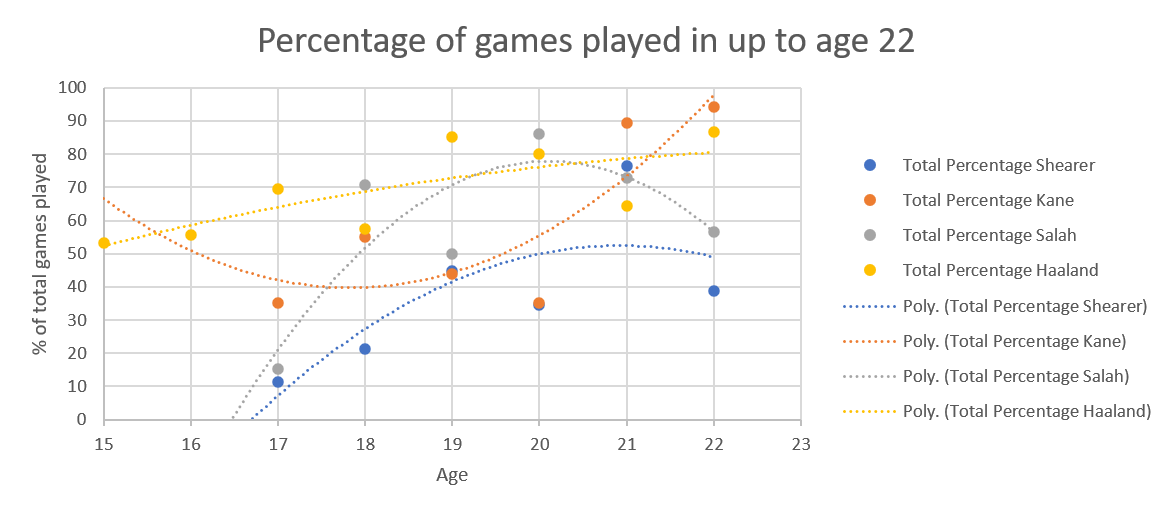
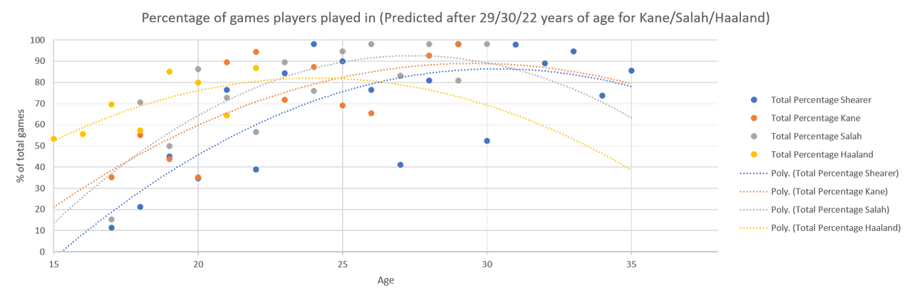
I strongly suspected that Erling Haaland’s goalscoring stats would have that effect on my graphs but he had such a good first season in the Premiership that I couldn’t really say no to L’s suggestion when he said “why don’t you add Haaland’s stats to the analysis?”.
I was right to think Haaland’s numbers were going to do terrible, terrible things to my graphs.
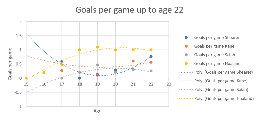
For percentage of games played, that makes the data look wild. First of all, Haaland’s so young that for actual data, there’s only numbers up to age 22.
The percentage of games young players play varies so much depending on circumstance, things like depth of talent at their club, whether they’ve been loaned out to another club to get some seasoning, whether the coach wants to build them up slowly. So many variables, so it’s really messy when you look at data from that age.
That variability is most clearly seen in Kane’s graph, which is upside down compared to the others.
Because there’s so little real data, the extrapolation in the graph to end of career, to 35 years of age because that’s when Shearer stopped, particularly effects Haaland’s numbers. On the other hand, it’s needed because everyone’s numbers go up after 22.
I think that explains why Haaland’s numbers drop so quickly in this graph and I think that’ll steady itself with another year’s data. I mean, according to this, his numbers max out at 24 and, barring injury (and may he be kept from those) that doesn’t reflect footballing truth.
The goals per game up to the oldest point all four players have reached is another one bent and mangled by lack of data.
That’s two upside down curves versus two right way up curves, because of the extrapolation needed because Haaland started in the adult leagues earlier than the others. Also, this was all while Salah was still a winger, which explains his low numbers.
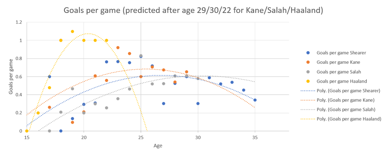
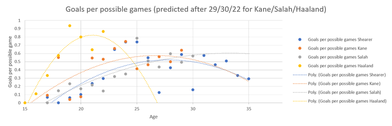
On the other hand, you can imagine the nonsense extrapolation makes of Haaland’s numbers if you send them forward to him being 35.
Meet the nonsense
According to the nonsense, Haaland stops scoring at 26. Again, may he be kept from injury, that is clear nonsense.
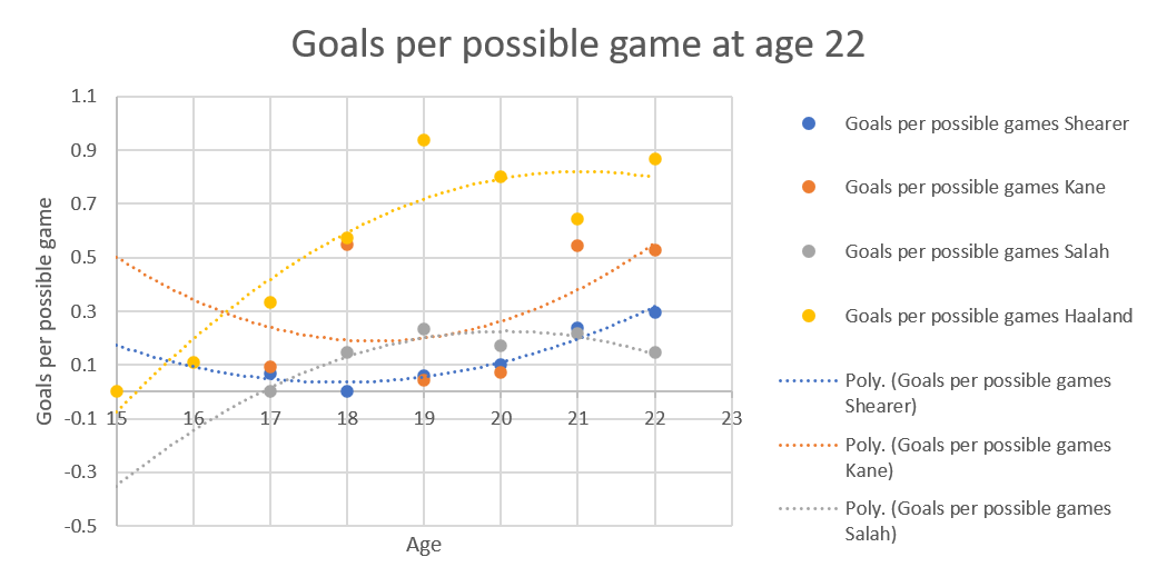
For goals per possible game, up to the oldest age all of them have achieved, we’re back in the land of the banana curve, due to extrapolation.
Again, it’s Kane and Shearer who are banana shaped, and Salah’s goals per possible game is lower than everyone else’s because he was still a winger.
Again, Haaland’s is that shape due to a lack of data.
It’ll be interesting to see the shape of his curve change next year.