This started as either a drunken conversation, a disagreement or a follow up to a Match of the Day stat. How vague my memory of parts of it is suggests one option above the others, but it has also been some time since the conversation happened which might also explain it.
Some time ago, Harry Kane missed a couple of matches due to an ankle injury, again. The “again” was the problem. It had become clear that if Kane had a weakness, it was his ankle not his game. Cue L saying that the thing that would stop Kane reaching Alan Shearer’s goal-scoring records would be injuries, because once you start having to miss games due to recurring injuries to the same body part, the number of games missed because of it is only going to increase.
L wanted to know whether the games per season Kane played up to this point matched Shearer’s or not.
I raised an objection, which is that Kane, playing for a decent Spurs team, probably has more chance of playing more games than Shearer had while at Newcastle, because while every team plays the same number of league games, there’s cups and European games to consider as well. (Shearer at Newcastle, excellent example of ‘the things we do for love’.)
So, it was agreed to calculate percentage of possible games played for Shearer and Kane. Alongside their stats, I was asked to include Mo Salah because he was scoring at a ridiculous rate and might have beaten Kane to any given record.
I used TransferMarkt’s data for all the players.
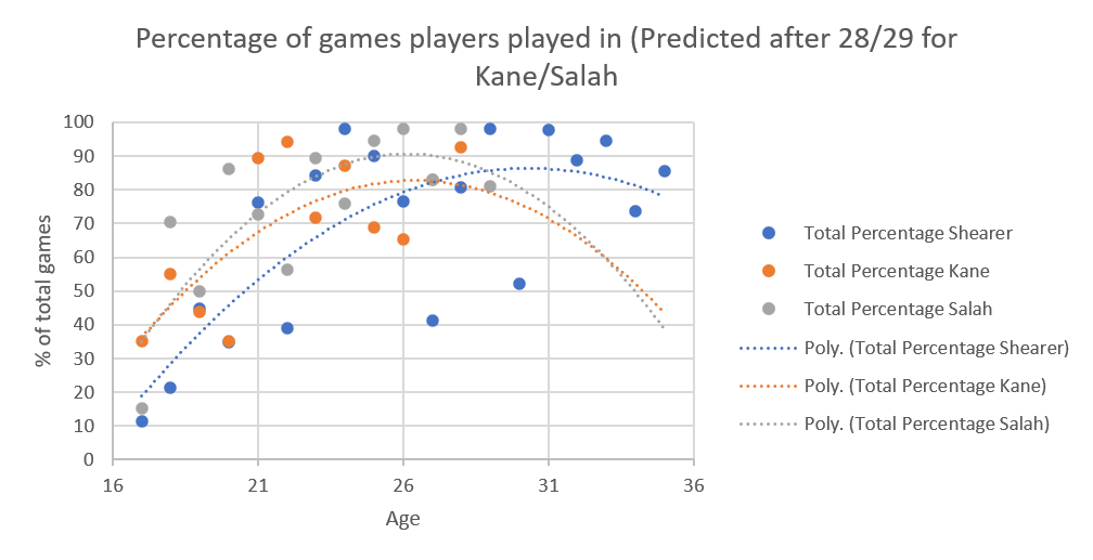
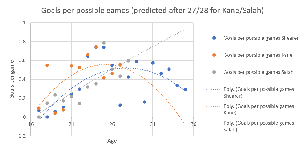
When Kane was 27 and Salah was 28 the data looked like this – dotted lines are polynomial lines of best fit.
Obviously, for Shearer (blue dots and dotted line) we had stats for his whole career.
The noticeable thing is that even at the end of his career, he was playing in a high percentage of Newcastle’s games (in his last year he played in 85% of Newcastle’s games), but this might have been because Newcastle really never had a replacement for Shearer ready at the time.
There is a reason he has a statue outside of St. James’s Park.

For the other two, the dotted lines are predictions and the lines look pretty different.
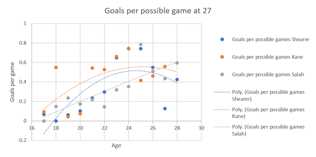
Let’s look at it if we only use the data up to the age of 27, the maximum age all had reached at that point.
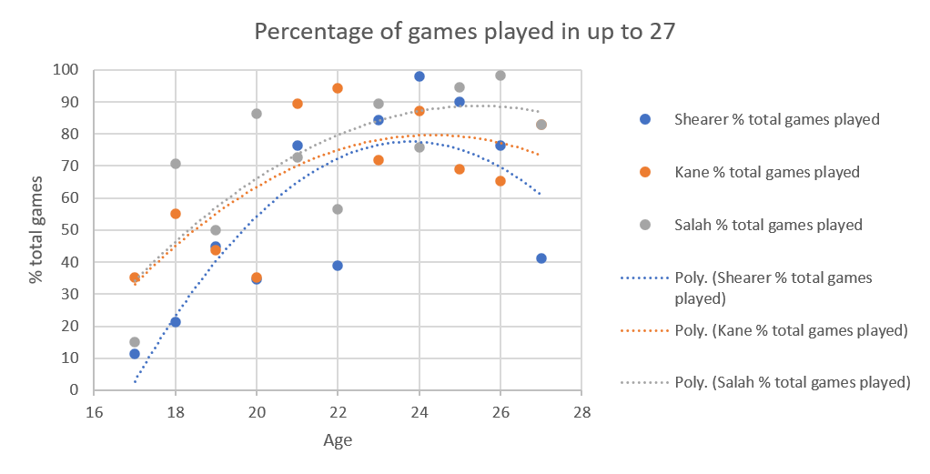
The curve for Shearer is heavily affected by his lack of games at the age of 27 (due to a long injury layoff).
You can see Shearer’s curve is a very different shape to the other two.
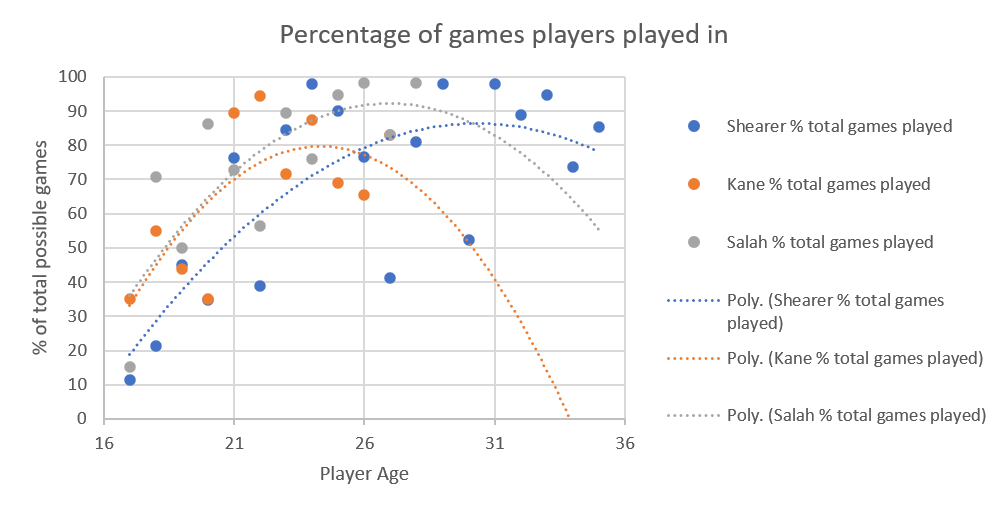
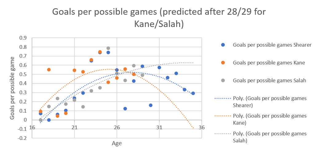
At the start of this year, when there was an extra year’s data, the percentage of games played with extrapolation looked like this:
You can see the addition of that extra year’s data changes the shape of Kane’s curve a lot. His curve was being brought down by one low percentage season. I don’t think the difference is an artifact, because if you look at the shape of the curves from actual data, not extrapolated (below), the shape hasn’t changed with the extra data.
I think the dip for Shearer is because the curve is still fitting his few appearances at 27 due to injury.
Okay so we have the data, but the point of a striker is to score goals, so how does goals per game look for the three?
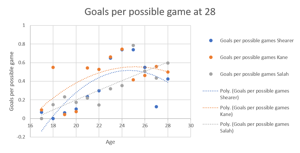
Looking to the projected stats at 27, they look like this:
The two lower blue dots for Alan Shearer, at 27 and 30 years, reflect the years he had his worst injuries, which does suggest that injuries also reduce potency as you come back.
It’s also interesting that while Shearer and Kane have very similarly shaped parabolic curves, Salah’s curve is almost hyperbolic, reflecting his performances in recent years.
If we look at goals per game only up to 27, it looks like this:
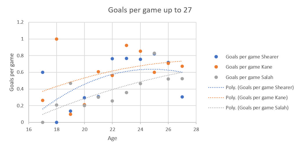
The really interesting thing is that Shearer has a curve while Kane and Salah have almost straight lines.
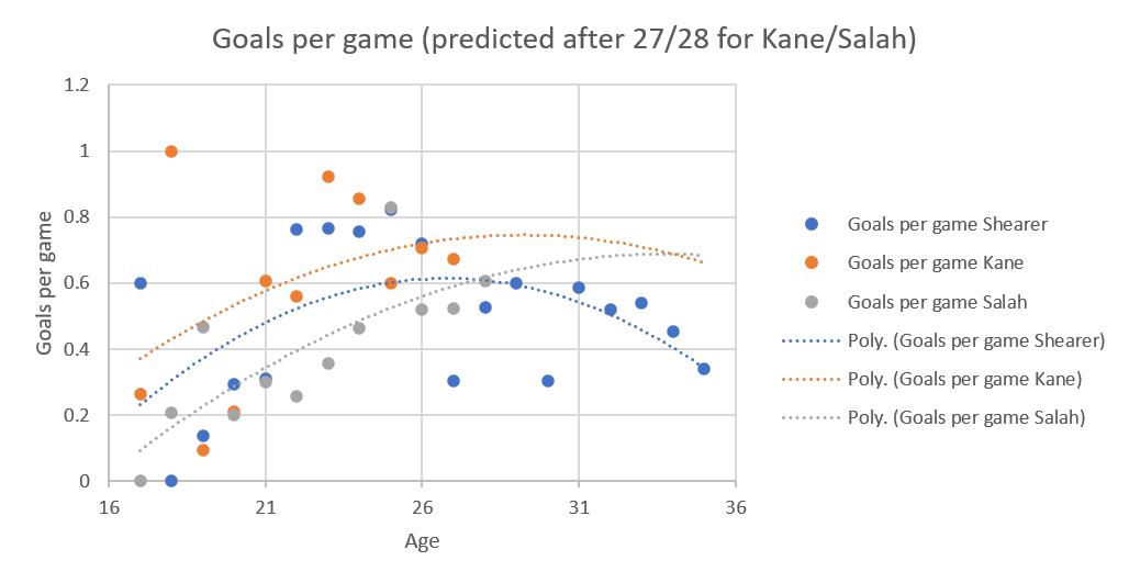
After the figure was updated to include the data once Kane was 28 and Salah 29, the goals per game curve (predicted) looks like this:
The shape of the three curves is quite different, Salah’s constantly increasing, Shearer’s a parabola, but a fairly shallow one, while Kane’s is a much sharper parabola. I’m not sure if that’s because of low goals per game last season skewing the whole curve, that frankly ridiculous season he had at 18 or a side effect of Spurs playing him slightly deeper now.
Looking only at data up to the age of 28 does suggest it’s an effect of Kane’s excellent year at 18, because in this view, his curve and Shearer’s are very similar, while Salah’s continue to show an increase, possibly due to him moving from wing to striker.
Salah’s curve has a completely different shape to the other two, possibly reflecting his change from winger to striker, whereas the other two have always been strikers.
It makes sense to combine the two analyses and provide the goals per possible games, because yes, Shearer had fewer opportunities. On the other hand, it may make Kane and Salah’s data look worse unfairly, given the modern tendency to squad rotation.
The extrapolated version at 27 looks like this:
which is unexpected. I would have expected deleterious effects to hit Kane and Salah equally but Kane’s curve really is warped by the poor year at 27, while Salah has a straight line because the extrapolation is more hopeful than even Liverpool fans that he can keep his form up.
I understand why the extrapolation is going haywire, because if you look just up to 27 without it (below), while Kane’s curve and Shearer’s curve again match, but Salah’s remains different, an almost straight line (possibly reflecting that Klopp doesn’t really do squad rotation).
I updated this at the end of last season.
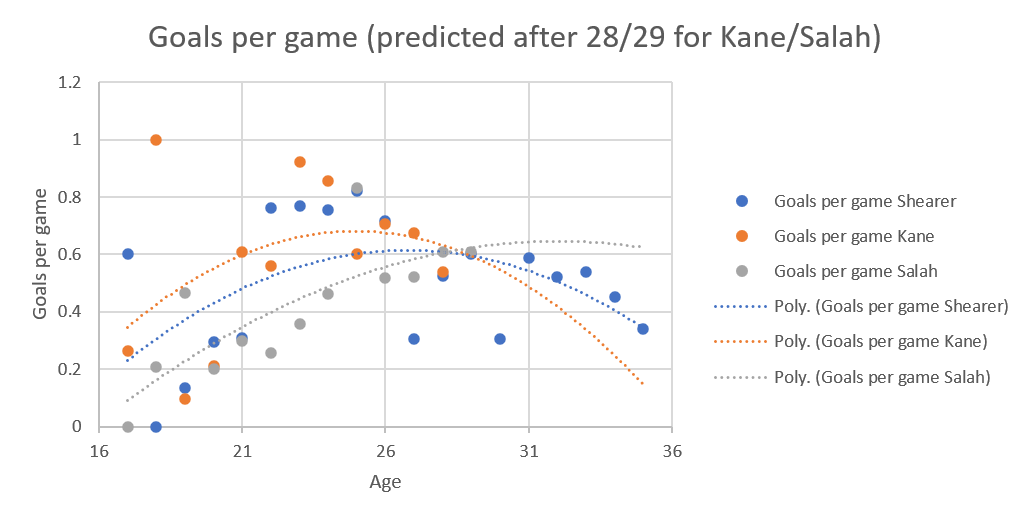
The extrapolated curve from Kane being 28 and Salah being 29 looks like this:
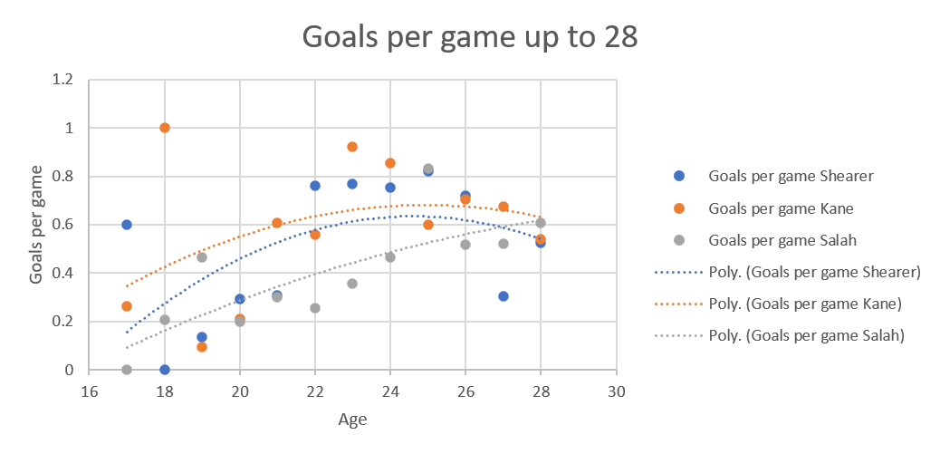
Last year is definitely reflected in Salah’s curve, and in Kane’s. While it could be Kane’s production dropping precipitously, I think it’s the extrapolation overegging the effect of the last year, because the curves without extrapolation look like this:
Shearer and Kane’s curves look very similar, while the continual increase of Salah’s goals per possible game continues to reflect his excellent form, his move from wing to striker and that Klopp doesn’t rotate his squad.
Where can this go? Well, there are 3 possible future things I’m thinking of looking at.
Going from most obvious to least obvious:
1 – Yearly updates of this data, to find out a) how good the extrapolation was at predicting what will happen, b) find out if Liverpool’s ‘orrible year this year has any effect on that stunningly straight curve shape of Salah’s, and c) see if the drop for Kane in the prediction is just a blip.
2 – Include Wayne Rooney’s data. He’d act as a nice control, retired player, whose position shifted from striker to something deeper.
3 – Add Haaland. This is another suggestion from L. I don’t think it’s because he wants to drive me round the twist but I fear it’s going to weird things to my graphs.
@mixed_knuts for @statsbomb once gave a talk where he discussed the effect of that year Burnley really outperformed expectations had on Statsbomb’s analyses. Burnley’s data was so different to everyone else’s that after every analysis they had to check whether any outlier was a bug or just Burnley being Burnley.
I think Haaland would cause the same thing. His goalscoring for his age is ridiculous. On the other hand, he’s young enough there’s no saying he’d be able to keep it up. That’s the one advantage to the above comparison being Kane and Salah, they were already in the middle of their careers when I started it, there was a solid amount of data. Even from that, the very basic extrapolation done by Excel has problems fitting the data. I dread to think what it’ll do to Haaland’s data.

One thought on “The King; his Heir Apparent…and The Pharaoh waiting in the wings – Shearer, Kane and Salah, games and goals per season.”